
DEMO
transition
description:设置对象变换时的过渡,指定对象属性的值发生变化时的过渡动画。
transition:transition-property || transition-duration || transition-timing-function || transition-delay
default: all 0s ease 0s
transition-duration
description:设置对象过渡的持续时间
transition-duration:<time>
transition-property
description:设置对象中的参与过渡的属性
value: none | all | [IDENT]
none指所有属性都不参与过渡;all指所有属性都参与过渡;[IDENT]指定个别属性参与过渡。
|
查看演示:transition demo
此时我们hover在.button上的时候,可以看到.button元素的background-color属性值会从#800过渡到red,.panel的height的属性会从0px过渡到180px。如果此时我们在.panel中增加文案,之前设定的180px已经展示不下新的文案,所以需要把代码.button:hover + .panel选择器中的height: 180px改成height: auto,这时我们再看看页面效果。(点击查看DEMO)
此时会发现,.panel的高度不再有一个过渡的动画,而是直接从0px瞬间变化到auto,这是为什么呢?
注:并不是所有的属性和属性值都能存在过渡动画。
这里特别需要注意的是,如果想要指定某个属性有过渡的状态,我们就需要保证我们能够计算出过渡过程中每个时间点的属性值。
比如,从height: 0;过渡到height: 180px;,过度时间是t,那我们可以算出在x时刻的属性状态是height: (180px-0)*x/t;。(注:这里公式成立的前提是假设transition-timing-function: linear;,如果transition-timing-function为其他值,一样可以计算,只不过算法不同)
然而刚才设置了height: auto;,则在x时刻的属性状态为height: (auto-0px)*x/t;,显然,这种状态是不存在的,因此在设置高度变成auto之后,也自然不会再有过渡动画了。
所以此处可以修改为使用transform: scale(1, 0);来代替height: 0;,使用transform: scale(1);代替height: auto;,如此一来,就又能出现过渡动画了,请看修改为transform后的DEMO。
再比如日常中最常使用的控制元素显示隐藏的代码是display: block;和display: none;,这也是不存在过渡动画的,因此,可以调整改为使用opacity: 1;和opacity: 0;来替换。
transition-timing-function
description:设置对象中过渡的动画类型,通俗的理解就是设置在过渡过程中元素值的变化速度
transition-timing-function: ease | linear | ease-in | ease-out | ease-in-out | step-start | step-end | steps(<integer>[, [ start | end ] ]?) | cubic-bezier(<number>, <number>, <number>, <number>)
预设的五个时间曲线
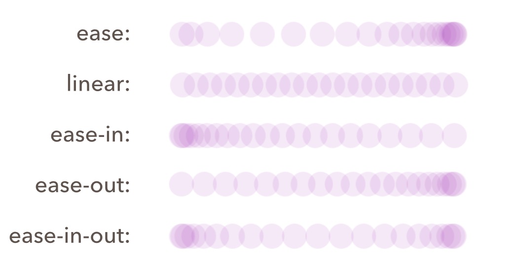
上图展示了transition-timing-function设置为ease, linear, ease-in, ease-out, ease-in-out的运动状态图。图中表示的是相同时间间隔捕捉到的小球位置,可以看出,在小球越密集的地方,表示其运动速度越快;小球越稀疏的地方,表示其运动速度越慢。
|
运行效果点击查看DEMO
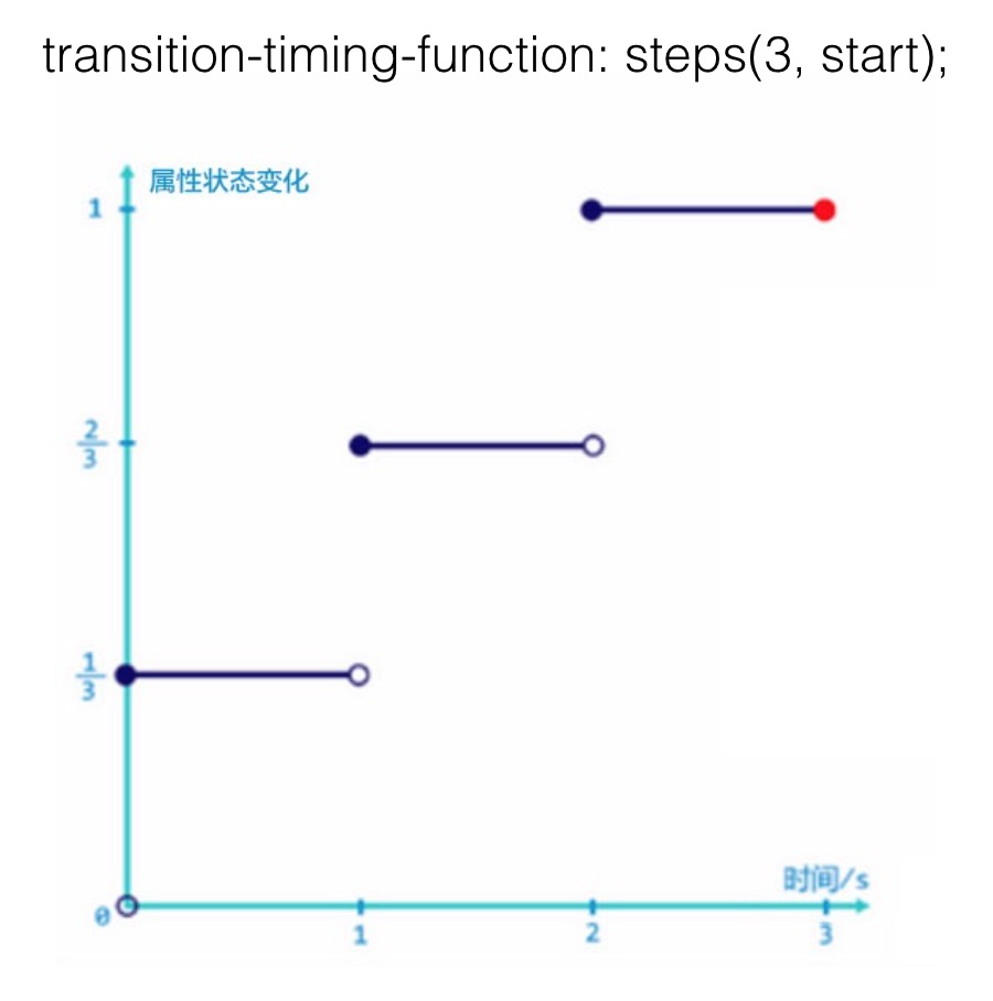
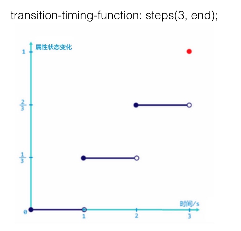
阶跃函数
steps(
阶跃函数指定接收两个参数,第一个参数为正整数,指定阶跃函数的间隔数;第二个参数可选,值为[ start | end ],为跃点,指定在每个间隔的起点或是终点发生阶跃变化,默认为end。step-start和step-end是steps函数的特殊形式:step-start = steps(1, start),step-end = steps(1, end)
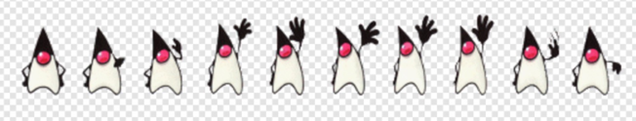
上图为一张500*72的雪碧图,其中有十个小企鹅,每个小企鹅50*72,连起来播放是一个挥手的动画。
|
代码中指定.hello的大小为一个小企鹅的尺寸,背景图片为上面的这张雪碧图,起始background-position: 0px 0px;,鼠标hover时background-position会过渡到-450px 0的位置,也就是最后一个小企鹅的左上角。这里设置了steps(9),其中9是因为我们希望每次阶跃变化的大小是一个企鹅的宽度50px,从0px 0px过渡到-450px 0,状态一共需要阶跃9次。点击查看DEMO
接下去看下一个例子,区别一下第二个参数设置为start和end的不同之处
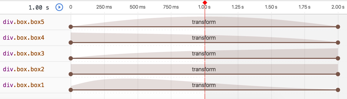
|
可以看到,.box1在鼠标hover的时候,他的宽度马上增加了100px,进入了第一阶段的状态,第三秒开始的时候,他的宽度已经达到了400px;而.box2在鼠标hover的时候,在第一秒始终停留在初始状态,直到第三秒末,宽度才变成400px。如下两张状态图:
start是在一个阶段开始之前就发生阶跃变化,整体过渡过程表现为跳过了初始状态。
end是在一个阶段结束的之后发生阶跃变化,整个过渡过程表现为跳过了最后的结束状态。
贝塞尔曲线函数
cubic-bezier(< number >, < number >, < number >, < number >)
贝塞尔曲线函数接收四个参数,取值范围为[0,1]。之前介绍的 预设的五个时间曲线 ,都可以转化为贝塞尔曲线的表达形式,如下所示:
ease: cubic-bezier(0.25, 0.1, 0.25, 1.0)
linear: cubic-bezier(0.0, 0.0, 1.0, 1.0)
ease-in: cubic-bezier(0.42, 0, 1.0, 1.0)
ease-out: cubic-bezier(0, 0, 0.58, 1.0)
ease-in-out: cubic-bezier(0.42, 0, 0.58, 1.0)
贝塞尔曲线函数,其实定义的是属性状态与时间的一个关系函数。如下坐标轴所示: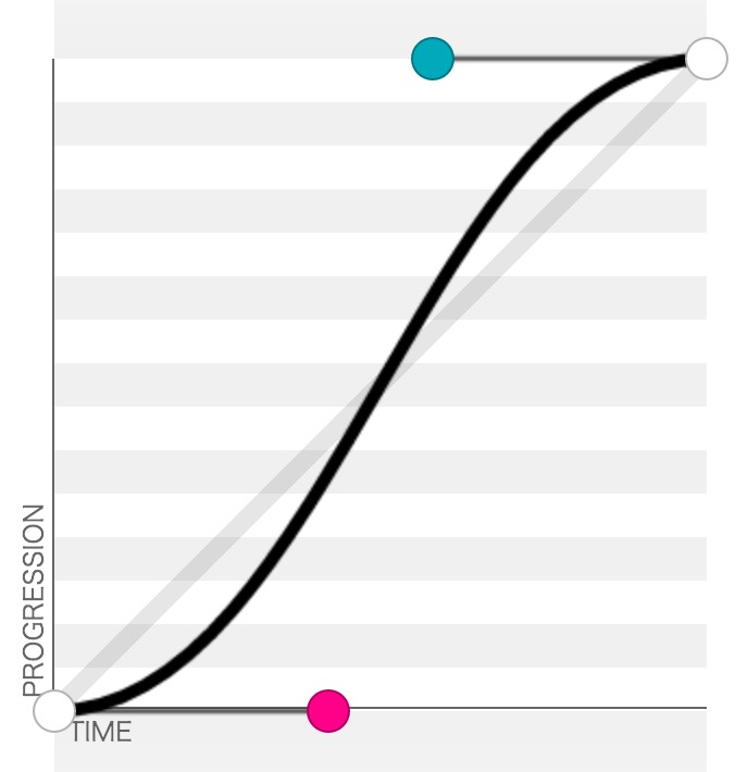
坐标轴中横坐标是时间,纵坐标是属性状态,最右上角的坐标是(1,1)。在时间曲线中的每一个点,表示的就是对应时刻下属性的取值,每个点的斜率表示的就是在这个时刻属性的变化速度,因此在时间曲线中斜率越小,也就是越平缓的地方,表示属性变化速度越慢;斜率越大,也就是越陡峭的地方,表示属性变化速度越快。如上图中开始跟结束的时候,斜率都比较小,而中间的阶段,斜率比较大,因此这个曲线表示的就是在变化过程中由慢到快再到慢的一个过程。
贝塞尔曲线函数的四个参数,前两个是上图中红色点的坐标(x1,y1),后两个是图中蓝色点的坐标(x2,y2),也就是 cubic-bezier(x1, y1, x2, y2) 这样的形式。我们可以在 http://cubic-bezier.com/ 这个工具上来调整我们独特的贝塞尔曲线,通过拖拽红色跟蓝色点,可以形成不一样的贝塞尔曲线。我们发现,其实规定取值范围在[0,1]之间,针对的是x坐标,也就是时间,因为时间如果超过了这个范围,就会出现在同一个时刻对应了两个不同的属性状态,这个是没有意义的;而y坐标是可以超过这个范围的,如下我们通过拖拽两个点形成了这样一个曲线: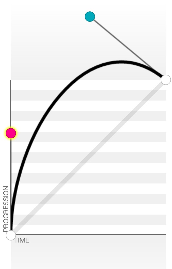
表示的是在过渡过程中属性值会超过终止状态的设定值然后在回到终点位置,表现为回弹的效果。
又或者是这样: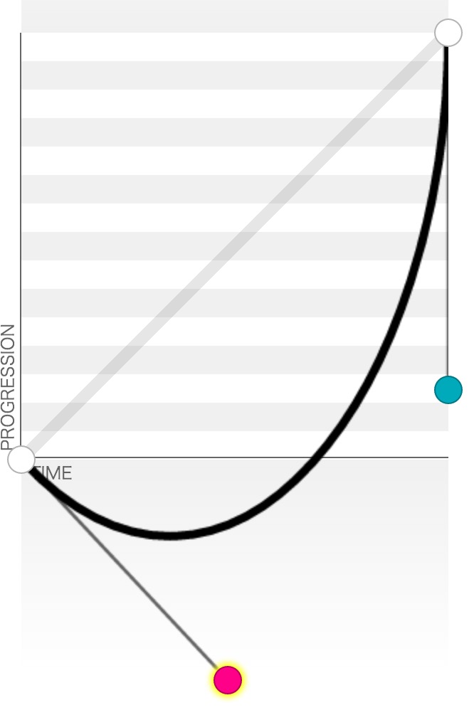
表示在开始的时候会往回运动之后再过渡到终点位置。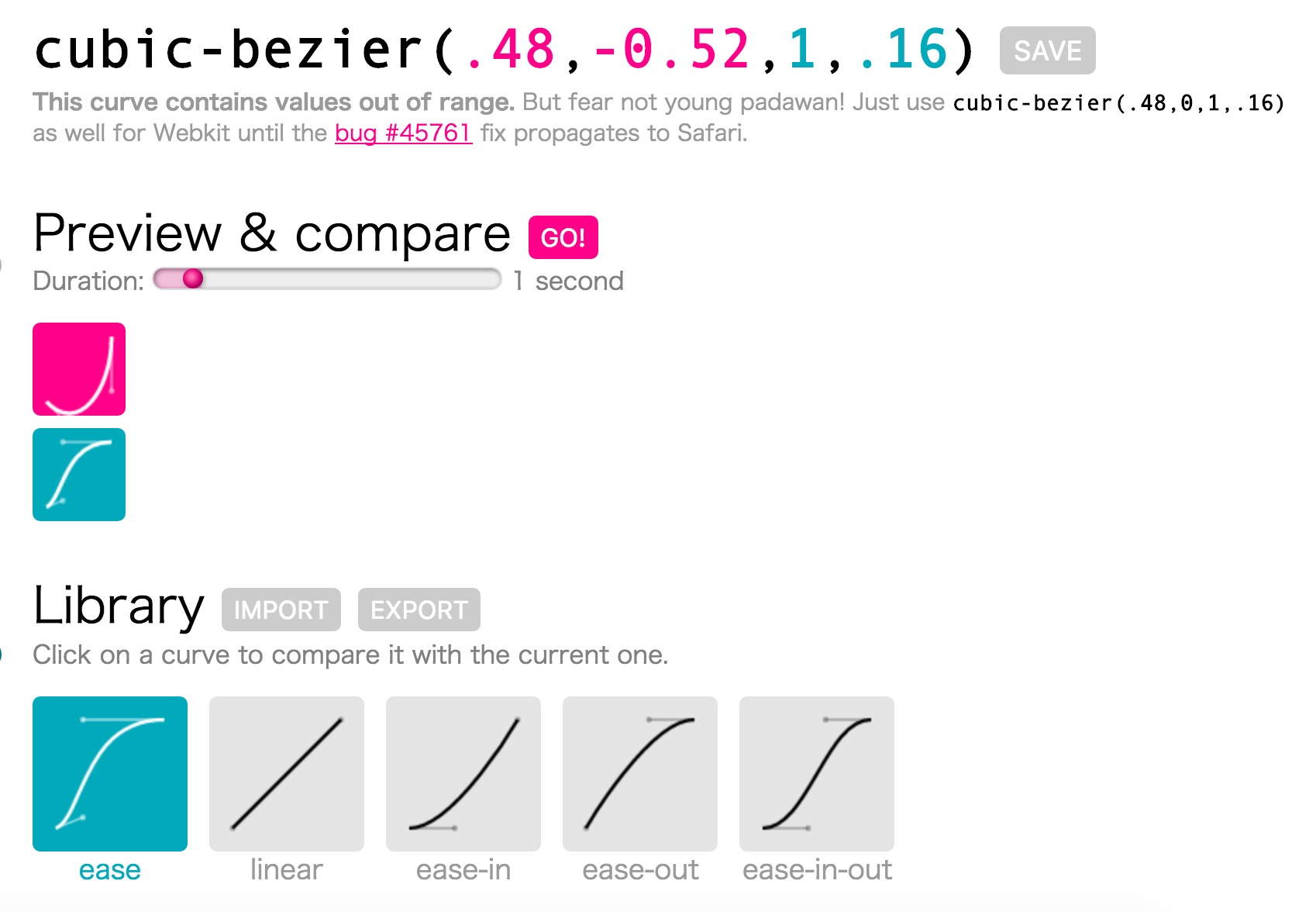
因此我们可以通过拖拽两个点来实现不一样的动画效果,在右边窗口可以看到最上面展示了我们调整出来的贝塞尔曲线表达式,点击 Preview & compare 右边的 GO! 按钮,既可以查看我们调整出来的曲线运动情况,红色的为我们调整的曲线,蓝色的为对照曲线,可以点击 Library 下面的曲线来选择不一样的参照曲线。
transition-delay
description:设置对象延迟过渡的时间
transition-duration:<time>
可以通过设置不一样的transition-delay来错开不同属性过渡的开始时间,呈现为按一定的顺序来开始过渡。
transition的不足
- 在页面加载的时候不能触发,因为只有在属性值发生改变的时候才会触发过渡动画。
- 动画不能重复播放,过渡动画只会播放一次。
- 无法设置多种状态(keyframes只有from,to),只能从初始状态过渡到终止状态,无法再设置其他的状态。
- transition规则作用的是单个属性的过渡状态,不能涉及多个属性,即使定义了
transition: all 1s ease 0s;这样的规则,其对应的每个属性过渡动画也都是相互独立,相当于是定义了很多个transition规则,而每个transition只作用于一个属性。
animation
description:设置对象所应用的动画特效。
animation: animation-name || animation-duration || animation-timing-function || animation-delay || animation-iteration-count || animation-direction || animation-fill-mode || animation-play-state
animation-name
description:设置对象所应用的动画名称(@keyframes)
animation-name:none | <identifier>
default: none
定义动画的写法如下:
|
其中from等同于0%,to等同于100%。
animation-duration
description:指定对象动画的持续时间
transition-duration:<time>
animation-timing-function
description:设置对象动画的过渡类型
这里animation-timing-function的用法与 transition-timing-function 类似,就不在多做介绍。
|
上面的代码为两个.box指定不一样的animation-name:move动画让box从translate(0)运动到translate(400px, 0),动画时间是2s;anotherMove动画让box第一秒从translate(0)运动到translate(200px, 0),第二秒再从translate(200px, 0)运动到translate(400px, 0),比较这两个动画是否相同?点击查看DEMO演示
实际运行效果两个动画并不相同,他们的运动情况如下所示: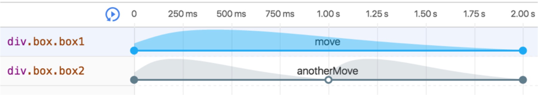
可以看到,animation-timing-function作用的对象,其实是两个关键帧之间,而不是整个动画过程。
animation-delay
description:指定对象动画延迟的时间
transition-duration:<time>
可以通过给每个动画设置不同的animation-delay来设置每个动画开始的时间,调整每个动画的播放顺序。
|
上面的代码为.box设定了两个动画,一个是zoomInLeft,控制让.box出现的动画;另一个是shake,控制.box的抖动动画。这里希望shake动画的播放在zoomInLeft动画之后,所以就要将shake动画的animation-delay设置为zoomInLeft动画的延迟时间加上动画时间,即:shake.animation-delay = zoomInLeft.animation-delay + zoomInLeft.animation-duration;。点击查看动画效果
animation-iteration-count
description:设置对象动画的循环次数
animation-iteration-count:infinite | <number>
default: 1
animation-iteration-count默认值是1,也就是只播放一次动画,这里可以设置一个正整数,表示你希望动画播放的次数,或者设置为infinite,表示无限循环。
animation-direction
description:设置对象动画在循环中是否反向运动
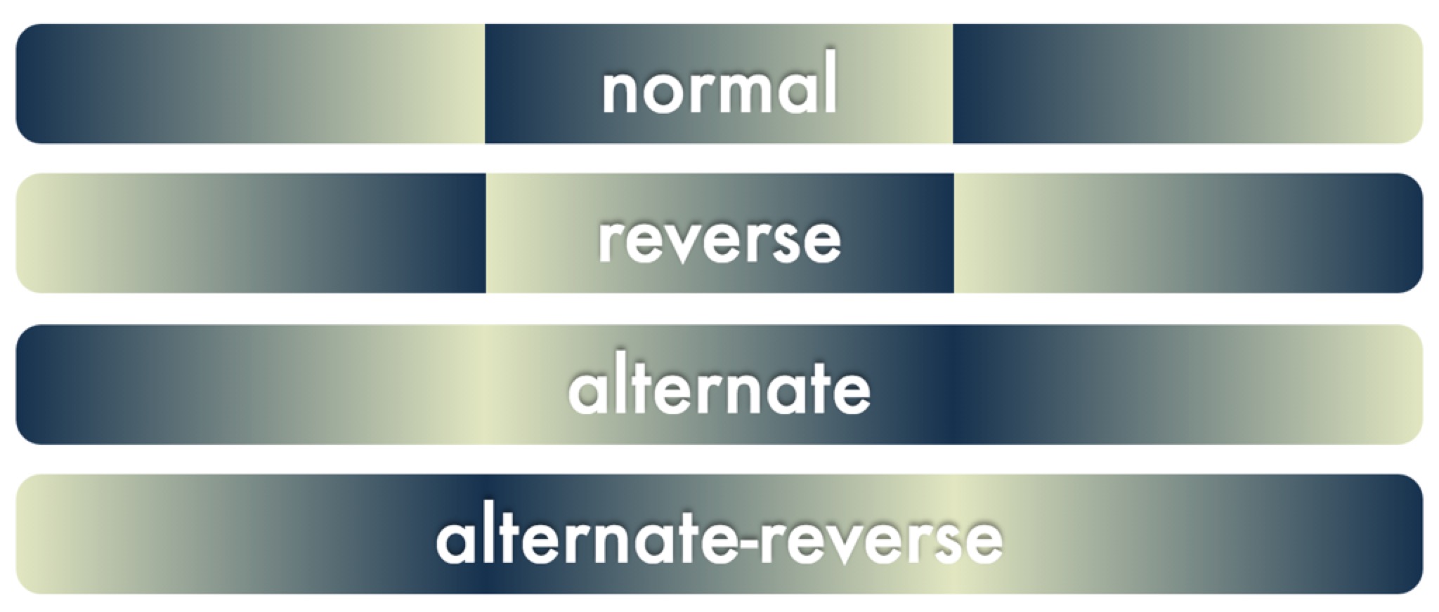
animation-direction:normal | reverse | alternate | alternate-reverse
default: normal
normal为正常模式,动画会从第一帧播放到最后一帧;reverse为反向模式,动画会倒着从最后一帧播放到第一帧;alternate设置动画先正向播放,第二次再从反向播放,如此交替;alternate-reverse则是先让动画反向播放,第二次再正向播放,如此交替。
|
代码为四个box分别设置了不同的animation-direction,点击查看代码运行效果
从DEMO的运行效果中,可以总结出这四个不同值的区别表现为如下效果:
在一开始的DEMO中有一个 模拟树叶飘落 的动画,树叶除了匀速下落的动画之外,还有一个左右旋转的动画,来模拟左右飘动,左右旋转就是通过设置对象的animation-direction: alternate来实现的。
animation-fill-mode
description:设置对象动画时间之外的状态
animation-fill-mode:none | forwards | backwards | both
default: none
animation-fill-mode属性用来设置对象动画之外的状态,动画之外的状态包括两个,一个是动画开始之前,一个是动画开始之后。none就是指定不设置动画之外的状态;forwards设置对象在动画结束之后停留在最后一帧的状态;backwards设置对象动画 开始之前 停留在第一帧的状态;both是同时设置forwards和backwards。
|
很多人不能理解animation-fill-mode属性各个值的区别,主要在于错误的理解了这个属性的含义,认为这个属性是用来设置动画结束之后的状态,于是就单单看了上面的这个 DEMO ,发现完全无法区分none和backwards的区别,也无法区分forwards和both的区别,不能理解both同时设置forwards和backwards到底是什么意思。
其实关键就在于没有理解animation-fill-mode属性设置的是对象动画之外的状态,不仅包括了动画结束的状态,还有动画开始前的状态。下面这个截图是W3C上对这四个值对解释: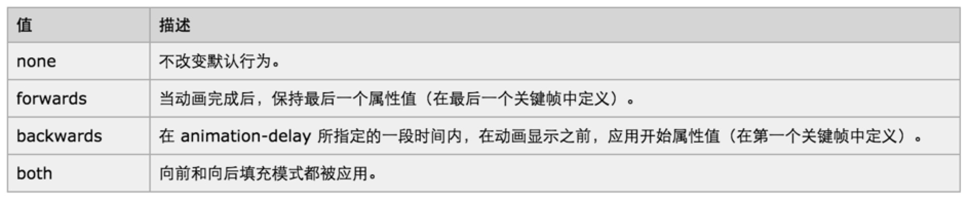
理解完这四个属性对真正区别,再来看下面对这个DEMO就不会再搞混了。
|
animation-play-state
description:设置对象动画的状态
animation-play-state:running | paused
default: running
可以通过animation-play-state来设置动画对运动和暂停,比如希望在鼠标hover的时候,让动画先停止下来,鼠标移开之后再继续播放,就可以通过设置.element:hover { animation-play-state: paused; }来实现就可以了。
零JS实现的游戏机DEMO
到此就介绍完transition和animation两个属性的所有子属性各值的区别和用法了,接下去看一个完全用HTML和CSS3实现的一个游戏机DEMO: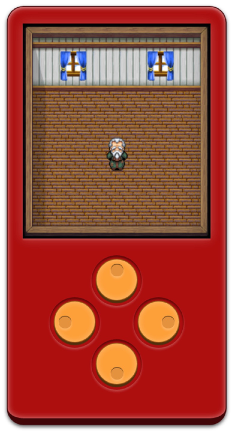
这个DEMO中的两个难点是如何划定人物移动的范围,还有就是在放开控制按钮的时候如何让人物停在当前位置。
- 人物的上下左右移动,是使用的
margin-top和margin-left属性的transition过渡来实现的,按下上下的时候,控制人物的margin-top到最上或最下的位置;按下左右的时候,控制人物的margin-left在最左或最右的位置,这样人物的移动就不会超过范围了。
注:这里不使用transform,是因为使用translate来控制人物左右位移的时候,还得同时维持他的translateY值;控制人物上下位移的时候,同样得维持他的translateX值。不使用transform来控制上下左右的位移,就是因为没法得知当前人物的translateY或translateX是多少。 - 放开控制按钮,让人物停留在当前位置,是因为在人物对象上设置了
transition-delay: 999999s;,也就是让人物属性发生变化的时候会先delay 999999s之后才开始过渡,在点击按钮的时候,再重新设置人物对象的transition使得人物属性值变化没有delay。这样就能实现当放开控制按钮的时候,让人物 看起来好像 停留在当前的位置。
JS VS CSS3 Animation
这里简单罗列几点JS动画和CSS3动画之间的优劣:
- 功能涵盖面,JS比CSS3大
- 定义动画过程的@keyframes不支持递归定义,如果有多种类似的动画过程,需要调节多个参数来生成的话,将会有很大的冗余(比如jQuery Mobile的动画方案),而JS则天然可以以一套函数实现多个不同的动画过程
- 时间尺度上,@keyframes的动画粒度粗,而JS的动画粒度控制可以很细
- CSS3动画里被支持的时间函数非常少,不够灵活
- 以现有的接口,CSS3动画无法做到支持两个以上的状态转化
- 实现/重构难度不一,CSS3比JS更简单,性能调优方向固定
- 对于帧速表现不好的低版本浏览器,CSS3可以做到自然降级,而JS则需要撰写额外代码
- CSS动画有天然事件支持(TransitionEnd、AnimationEnd,但是它们都需要针对浏览器加前缀),JS则需要自己写事件
- CSS3有兼容性问题,而JS大多时候没有兼容性问题
Share
最后分享几个CSS3动画库:
Ending …
终